Art Direction & UI-Design
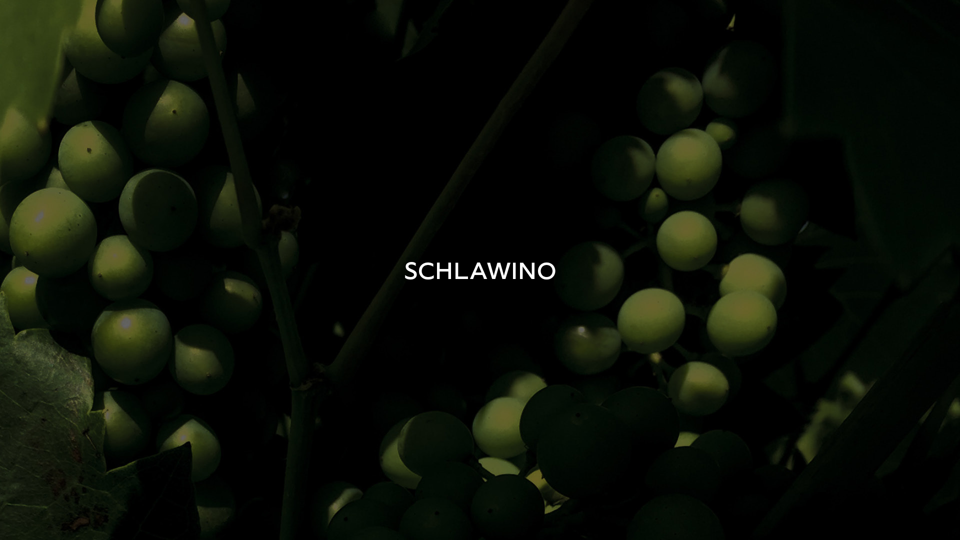
SCHLAWINO – Wine from Vienna
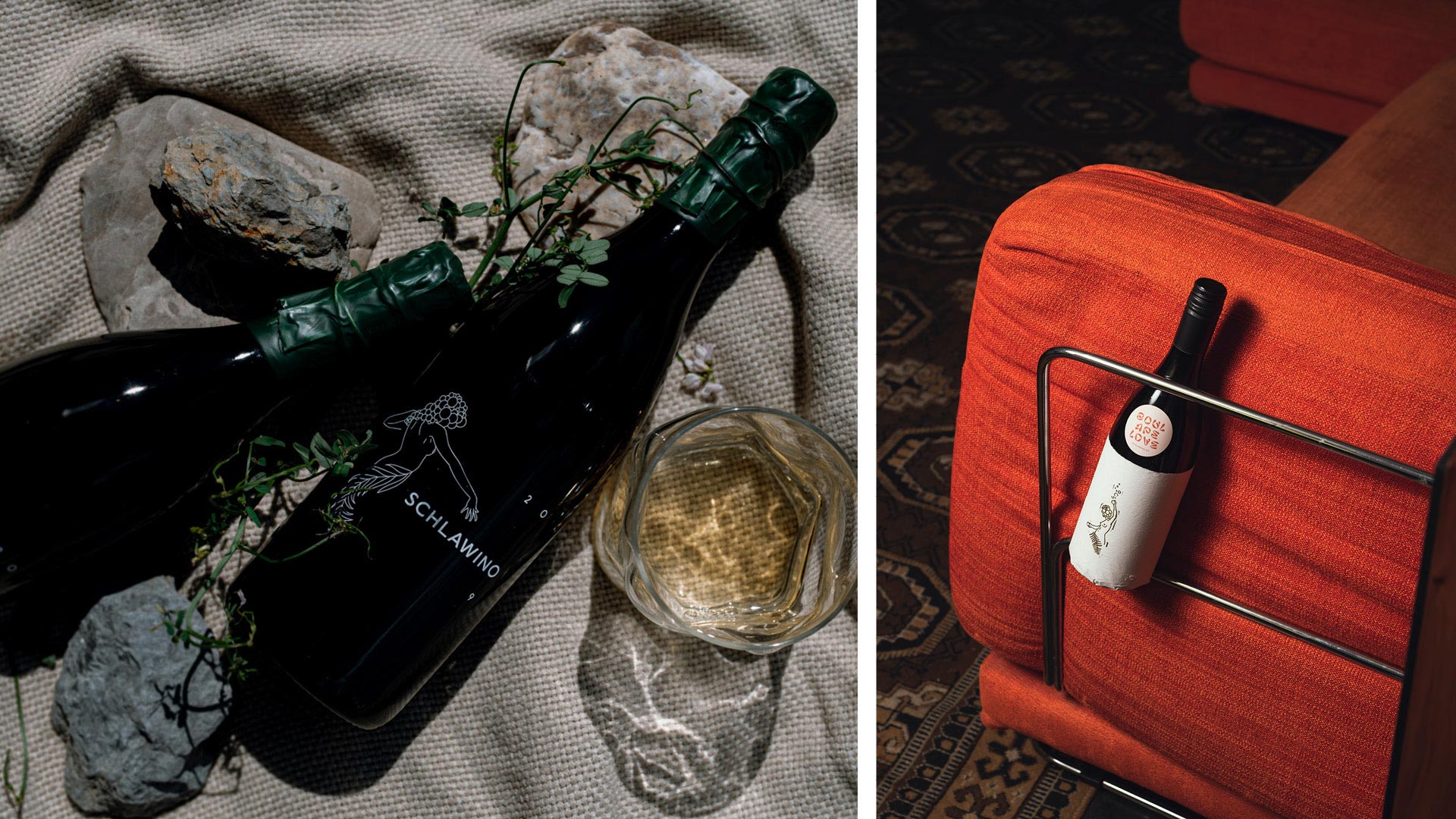
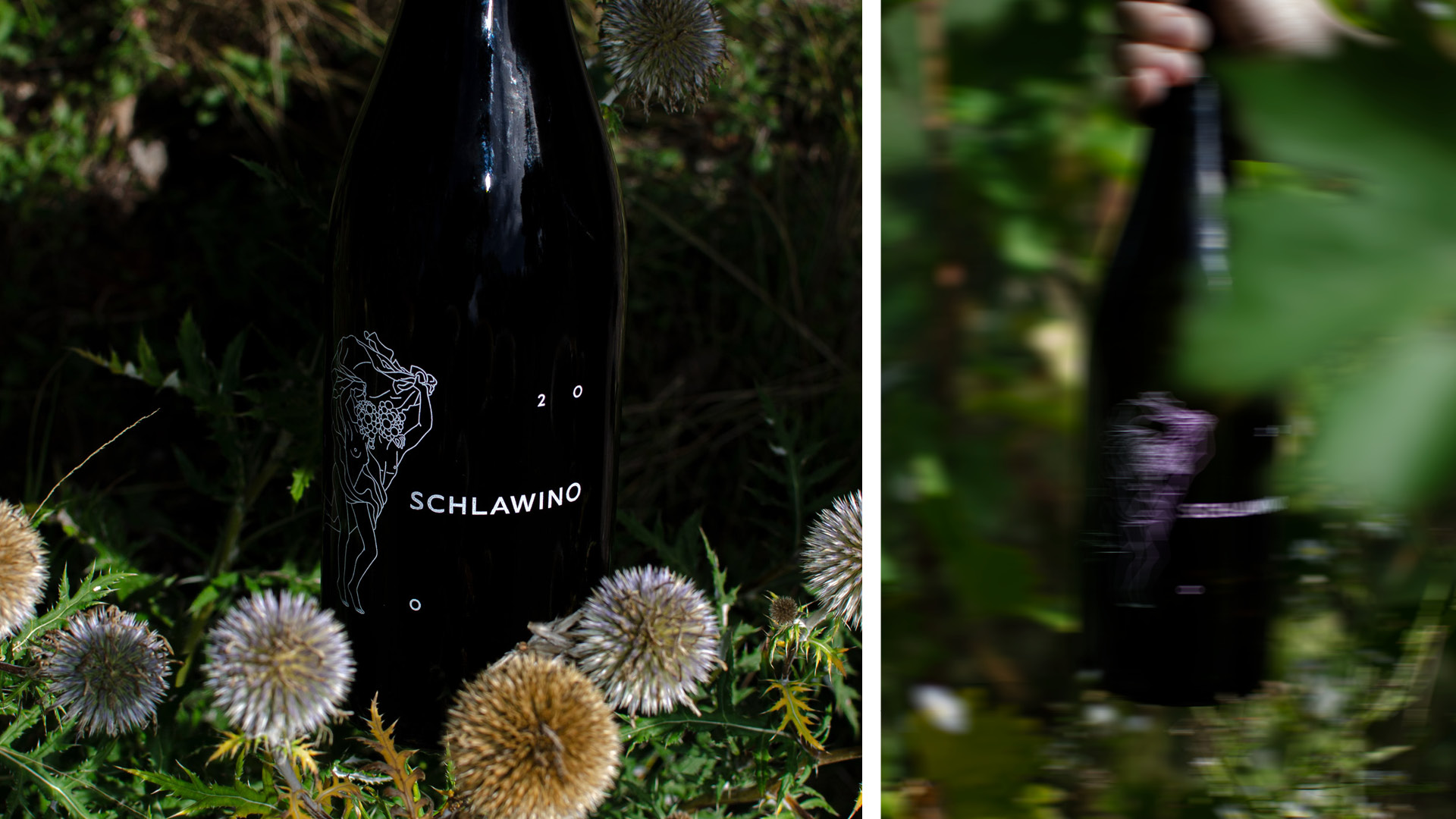
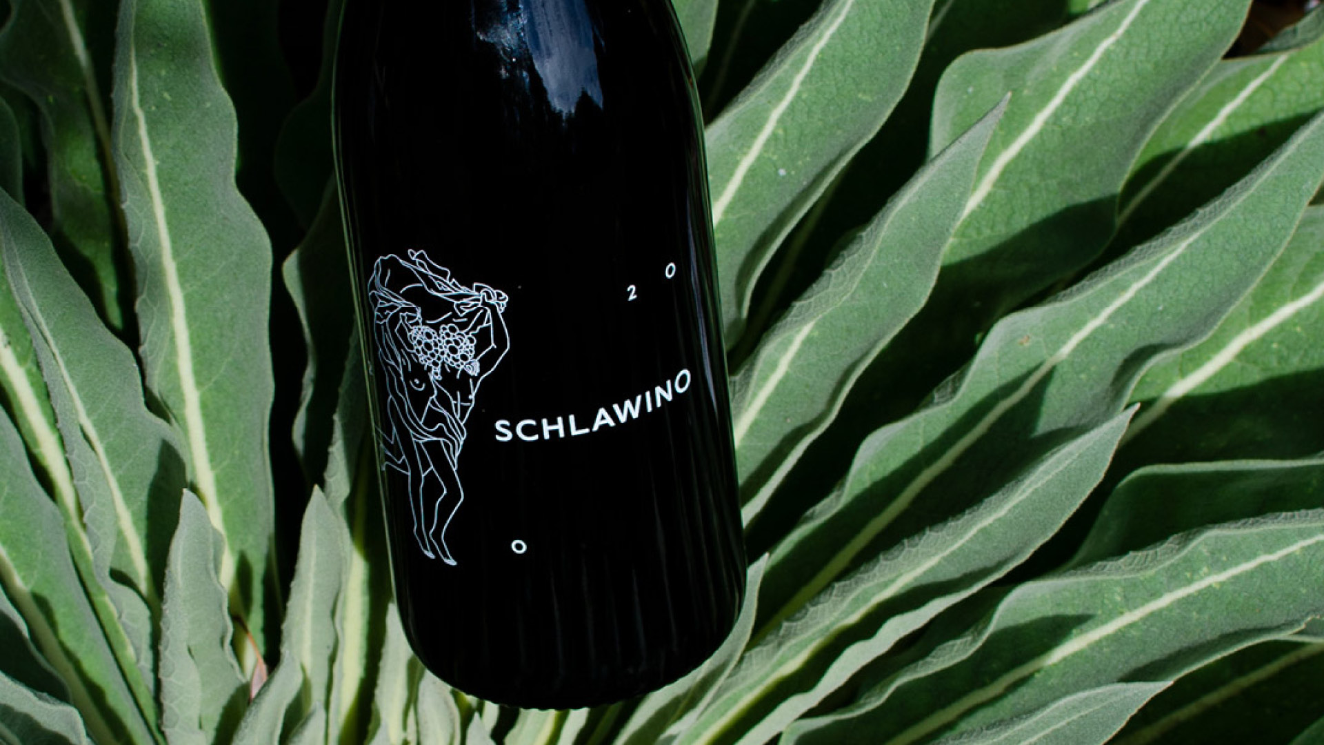
Natural, devoted and pure – this is how Max Pohanka and Alexander Harrer have been running their small vineyard in Vienna with friends for 10 years. To highlight the pureness of the wine, the bottles were never printed with real labels, but also as pure as possible only finished with screen printing or wrapped in paper. The illustrations on the bottles reflect the devotion and infatuation of the two amateur winemakers to their product. For each vintage, a new illustration was added, which should also address the special character of the wines.
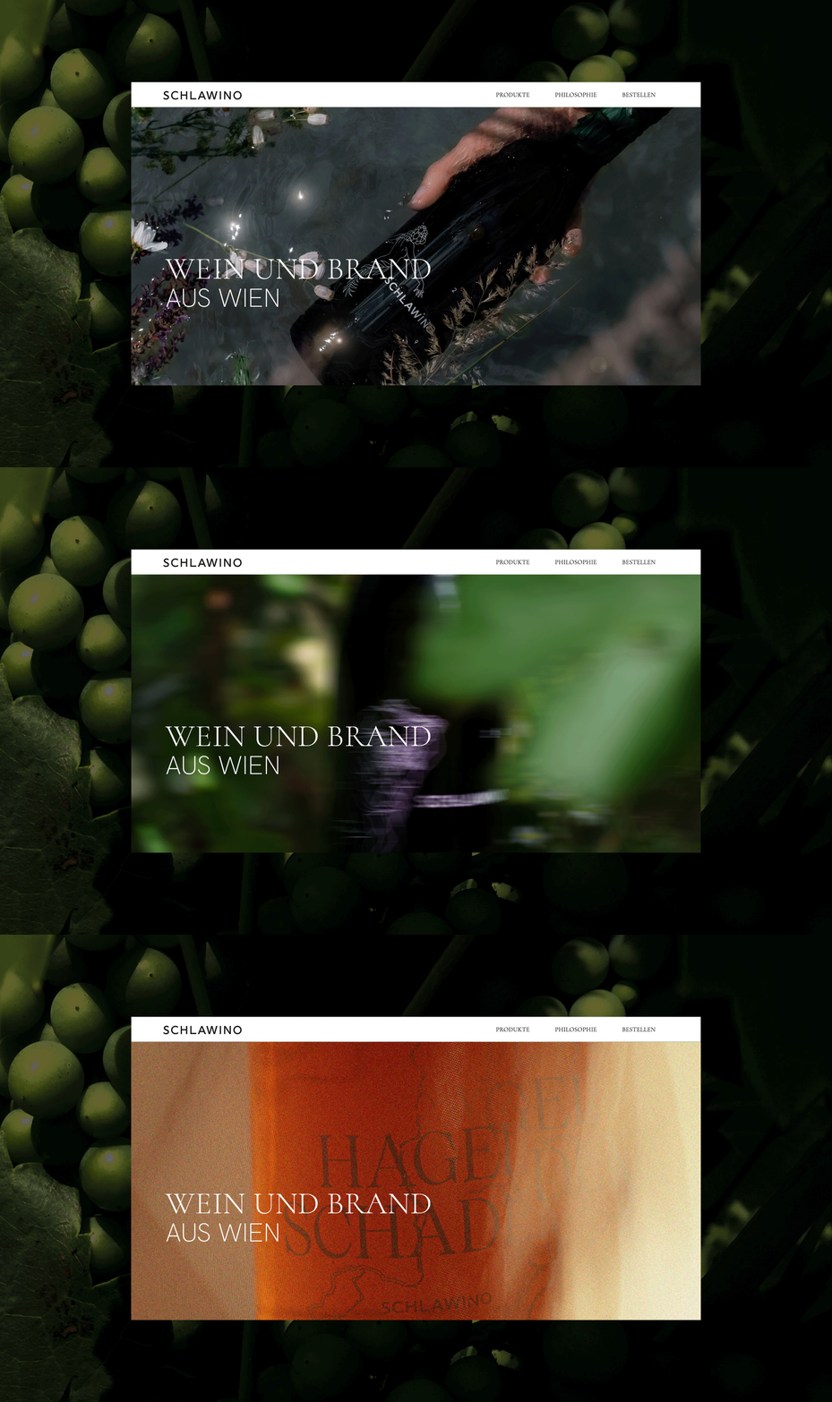
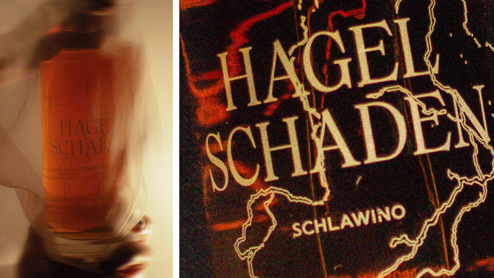
The 2021 vintage has then exceptionally become a grape brandy called “Hagelschaden” and was deliberately designed and illustrated by Christiane Preuss rougher and harder. Here too, however, the bottle is again only finished in one color with screen printing and thus fits in with the chronology of the other vintages, despite the strikingly different design.
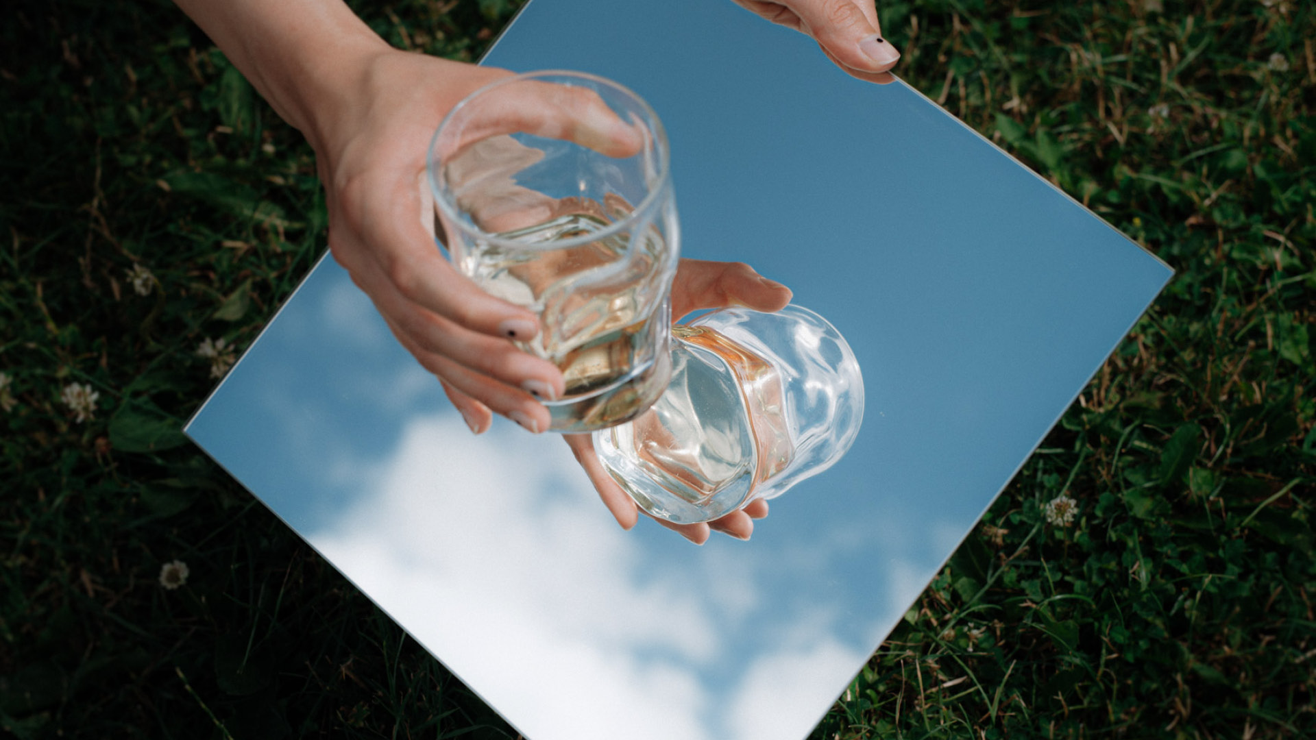
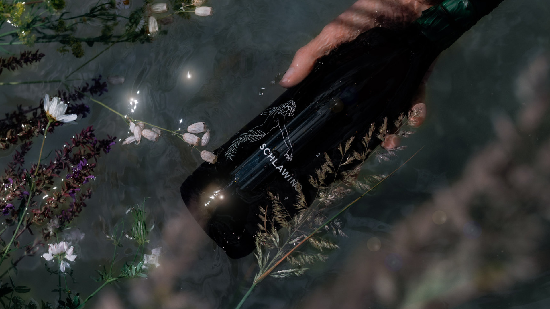
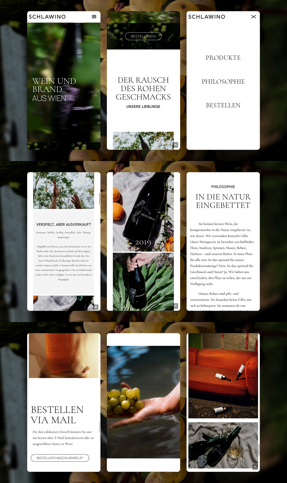
For other media, such as the website, I played with reduced, classic typography and exciting product photographs. The focus is always clearly and unambiguously on the product and thus also on immersion in the world of Schlawino.
